Bulder - from idea to launch in a year
In the autumn of 2018, the CEO of Sparebanken Vest, announced that they would launch a new national, mobile-only bank, later known as Bulder Bank. This started a snowball of events that would involve hundreds of people. But how to get this snowball to run in the direction you want? Here are 13 concrete tips I believe played an essential part in making this a successful launch:
- Decisions. From the first week on, we had regular decision-meetings with key stakeholders where we made hard choices and prioritized. This was a small team consisting of UX designers, CTO, CEO, and project manager. After each meeting, we posted all decisions to a Slack channel for transparency.
- Sketch in the open. We sketched everything out in Figma and invited the whole team, and this way, everyone got a saying and saw where we were going with the design from day one.
- NeedScope. While creating the brand for Bulder, NeedScope was used for positioning the brand. After researching the positions of other banks in Norway, it was clear that the red segment would be perfect for positioning a new bank that would challenge the traditional banks. This framework was efficient for us as UX designers, and we could continuously ask ourselves if this was for the red segment and if it would nudge us in the right direction.
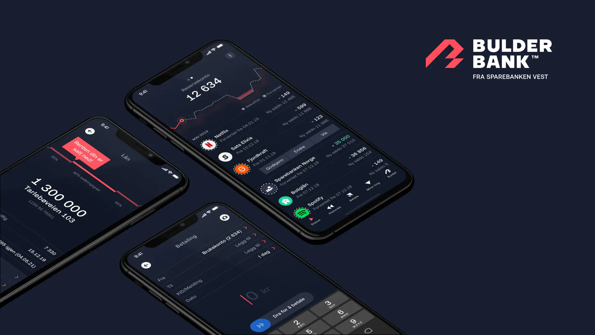
- Dogfooding. As soon as the services were available in the app, we would get our paychecks and invoices into Bulder and pay from the app to observe how it worked. We got custom-made temporary cards to test everything from push notifications from ATMs and transactions abroad and what information to show.
- Guerilla testing. As soon as we had a basis sketched out in Figma, we linked it up as a prototype to test our assumptions. Did people find what they were looking for? We even designed features we knew were years ahead to see if they had a natural location in the information architecture.
- A close team. Developers were an integral part of creating the design. They continuously came with better design solutions based on the APIs available and how we could utilize existing patterns and components.
- Dual design. Having two designers working together (much like pair coding or pair writing) was immensely useful. It’s great for learning, developing multiple ideas, sharpening the design process, and creating tidier and more maintainable design systems.
- Open Thursday. Creating a company within a new company has its challenges. One of the established measures was “Open Thursday,” where we served beer and presented the work from the last week. Open Thursday helped be transparent to the rest of the organization and get feedback from experts within its field within banking.
- Industry experience. There is no hiding that this wouldn’t be possible without industry experience from business developers, developers, and designers. There are many regulatory rules and systems for banking and finance, and knowing this saves a lot of time when you are building a new bank.
- Deadline. A deadline that seemed possible but hard to reach was essential to prioritizing what to make, and this made us focus and worry about the crucial parts. You could design and code forever in a project like this without letting real users into your project.
- Gradually opening for real users. We made a signup page for people interested in the product early on. This list evolved to about 3 000 people that ended on our beta-list, and we gradually added to our app to test the experience on real users.
- Feedback. We had multiple ways to get feedback that we collected in a Slack channel. We had a community, an email available from the app, and Facebook and Twitter presence to constantly monitor input.
- Backing. Last but not least, it is impossible to get a project like this running without backing from the whole corporation.
