Microinteractions - the secret ingredient
We’ve all been there: You’re paying a bill. Typing in what feels like hundreds of numbers. Checking to see if the numbers are correct. Checking. Again and again.
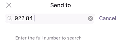
Vipps, the Norwegian mobile payment application, fixes this problem elegantly. You either type in the mobile-number or the name to the reciever, and you get to see their profile-image. This way you never need to double check if the number is correct. Hello, microinteraction!
What is a microinteraction?
Microinteractions are moments of delightful experiences or useful feedbacks helping the user accomplishing their task. These micro-moments are what guides the users through a flow in an effective and intuitive way. They are an underutilized but powerful instrument for designers.
A microinteraction consist of 3 (or 4) elements:
- A trigger - Something that releases the interaction. That could be typing in an account-number.
- Rules - Rules that describe what the interaction is and when it should happen.
- Feedback - The interaction is initiated and the user get a moment of delight or a feeling that this was useful.
- Loops and modes - How the interaction changes if it is used again and again.
The role of microinteractions in banking
Trust is what enables banks to exist. Microinteractions can play a small, although important, role in enabling this trust and security now that we don’t meet a person when we’re handling our money.
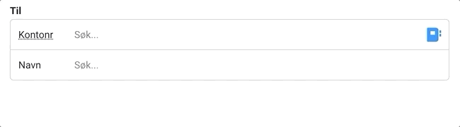
The best cases for microinteractions are moments where the user feel insecure. This is the moment where we as designers must step up the game and help the users. One of my favorite examples of this is a feature we implemented while I worked as a consultant in Skandia:banken (now Sbanken). When you’re paying a bill and typing in an account-number, they show when and how much you last paid the same account. This way you can easily confirm that you don’t pay the same invoice again, or that the amount is the same as previous transactions.
The details are not the details. They make the product.
Charles Eames
Guiding the user
Consider one of the most prominent microinteractions in online banking: the thousand-separator in input-fields. It’s a feature you don’t think about, but you sure do notice when it’s gone. It is an interaction that a developer has used hours to add, just to make your bank-experience a tiny bit better.
The thousand-separator has:
- a trigger - typing a number more than three digits.
- rules - when the number is above 999 there should be a gap between the first number and the three next (and a lot of other rules).
- feedback - the interaction is initiated and it’s easier for the user to understand how much they have actually typed in.
Some microinteractions also need loops or modes to work: Say you are transferring money and type in a higher number than what’s on the account. If the input-field then subtly shakes when you are leaving it, it indicates that there are not enough money. If you don’t understand the shaking the first time, delete the number and type it in again the user should probably get a message explaining why the input is saying no. If not our delightful little interaction suddenly is becoming an annoying experience.
Imprisoned by our design tools
Microinteractions are unfortunately an underutilized tool in designers toolkit. They are easily forgotten. We’re imprisoned by our design tools. Whether you use Figma, Sketch, Framer, Adobe XD or Illustrator (++), they all have the restriction that they are static sketches (maybe except Framer).
You can’t easily prototype what happens when it is time- or trigger-based, for example if you type in a number outside coverage. If you can’t easily prototype it it’s easily forgotten. This is where an actual prototype in code shines and why it’s a foundation for our projects to jump into code rather early.
A few helpful questions before designing a microinteraction
- Do I need to add a new element? Microinteractions are often best when they seamlessly flow into your existing design.
- Does the interaction feel the same the 1st and 5th time? Make the interaction adapt to the context and the user. It’s fun if it rains confetti the first time you log into the bank, but can become tiresome and ironic if it happens every time you log in.
- Do I understand my users? Talk to them! Test your interface regularly! If you don’t know their motivations or how they use your bank you could be fixing problems that don’t exist.
- Am I using the right tools for sketching and designing our product?
