A Designer's quest to create a Pie Menu navigation for macOS
I hadn’t heard from my developer in over three weeks. My budget was dwindling. And all I had to show for a year’s work was a TestFlight app that only my friends and I could use. Was this the end of my attempt to rethink app-navigation for macOS apps?
This is the story of Pie Menu — how a designer with no app development experience ventured into creating a radial menu app for macOS. It’s a tale of Ukrainian bomb shelters, user feedback and the importance of resilience. But most importantly, it’s a crash course in turning a side project into a viable product.
Table of Contents
The idea
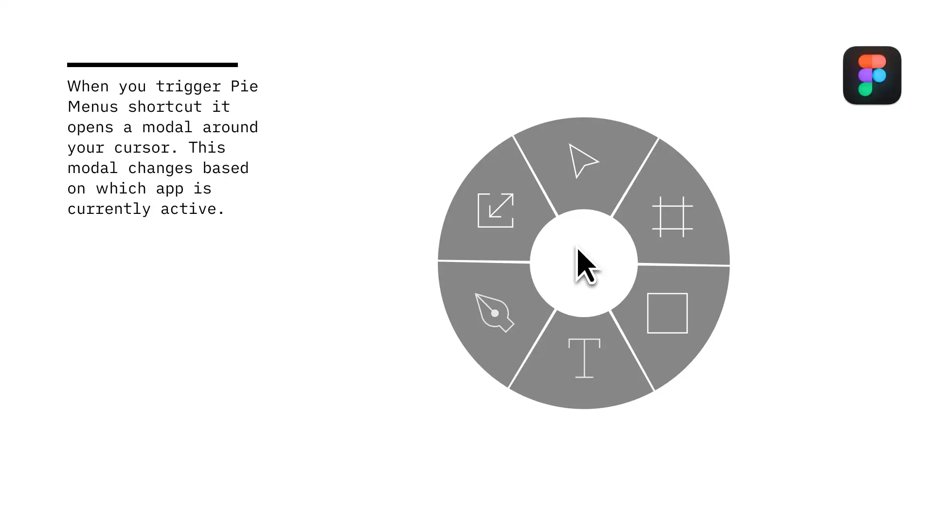
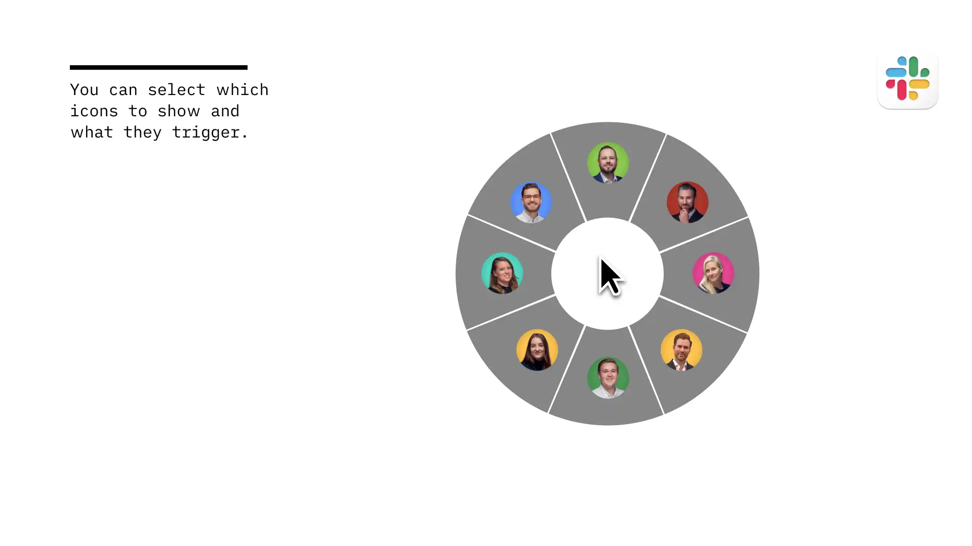
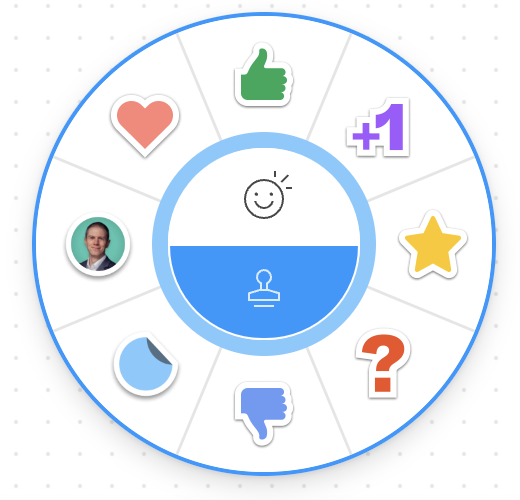
It all began when I opened FigJam and clicked on the stamp icon. I immediately thought, “Why isn’t there a radial menu available in macOS?” Radial menus are powerful tools for expert users, and the success of apps like Raycast, Alfred proves there’s a market for niche productivity tools.
My initial research into developing such an app quickly dampened my enthusiasm. Creating macOS apps was well outside my comfort zone as a designer and front-end developer. But fate had other plans: my holding company received some unexpected dividends. Was this a sign to take the plunge? What did I have to lose?
The brief
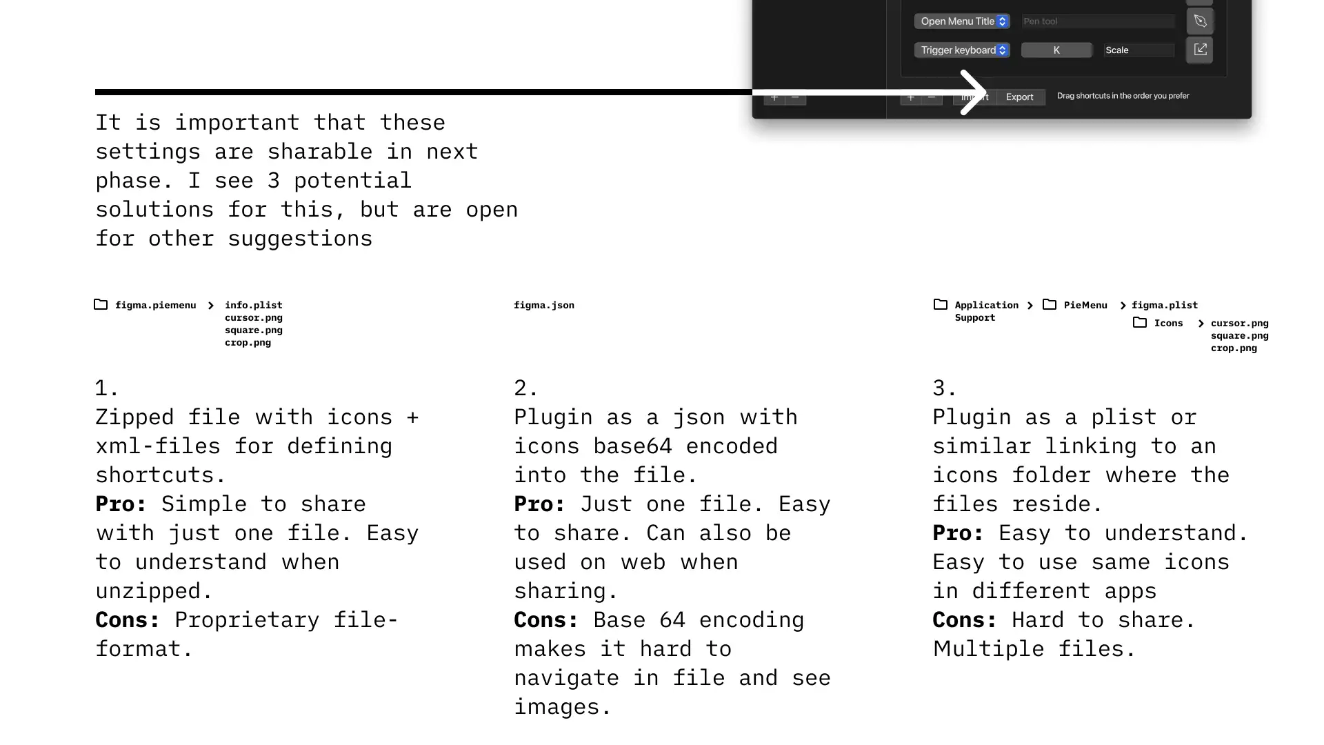
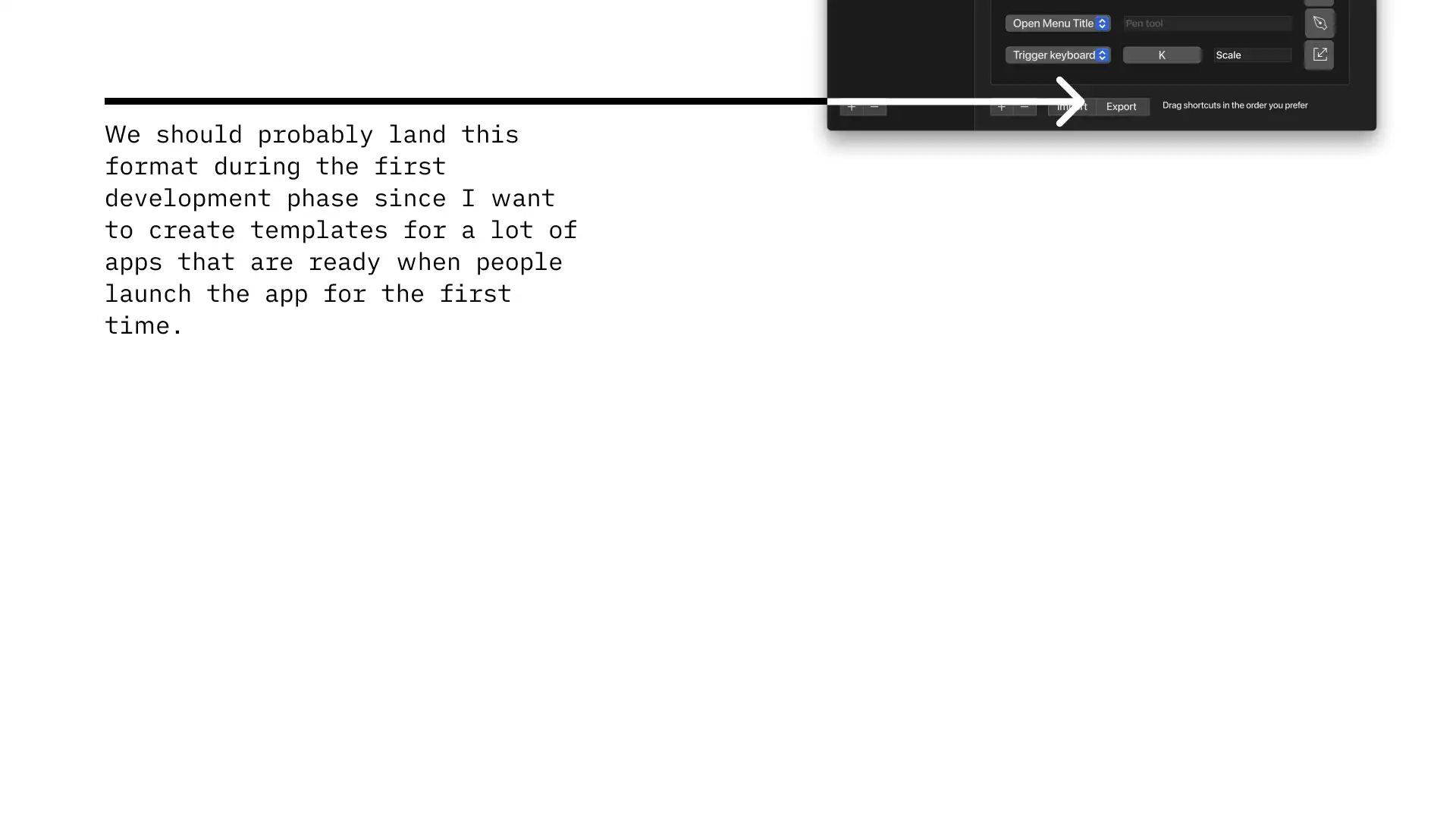
This side project offered me something I craved: complete creative control. Such freedom is rare in my day job as a design consultant, as I mostly need to adhere to other companies style guides. Realizing this was an opportunity I couldn’t pass up, I dove into Figma to sketch out my vision. You can explore my initial brief here:
This exercise was crucial in defining the project’s scope. It identified essential features, what could be postponed, and what needed to be perfect for the first release.
Developing the app
Armed with my brief, I searched for a Swift developer and, after some research, turned to Lemon.io. They quickly matched me with an experienced Ukrainian developer within my budget, and our collaboration began. We had a quick video-call, and after that we managed the whole project with a Kanban board in GitHub Projects, a DM thread in Discord and a Figma file.
The collaboration went smoothly, but the ongoing war in Ukraine presented significant challenges. My developer faced numerous obstacles, including bomb threats, power outages, unreliable internet, and closed kindergartens. There were periods where I didn’t hear from him for weeks, and I found myself more concerned for his safety than the project timeline. His resilience was remarkable. Despite the dire circumstances, he adapted impressively, even securing a Starlink system and generator to keep operations running. This situation was a stark reminder that behind every remote collaboration, there are real people dealing with real-life challenges. This collaboration gave me a personal connection to the ongoing situation in Ukraine, making the global crisis feel much closer to home as we got to know each other.
Despite these challenges, our work continued. The extended timeline allowed for extensive product testing and continuous feedback from a select group of beta testers. Their response ranged from excitement to indifference, highlighting the challenges and unpredictability of product creation.
App Onboarding
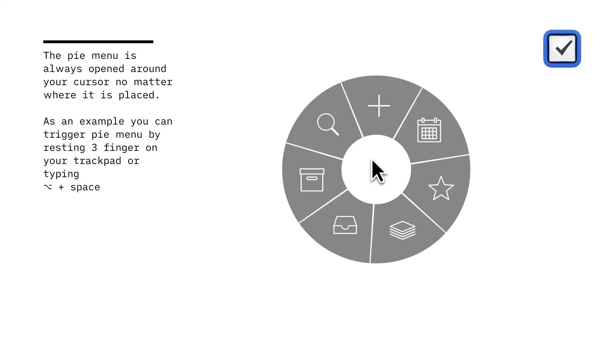
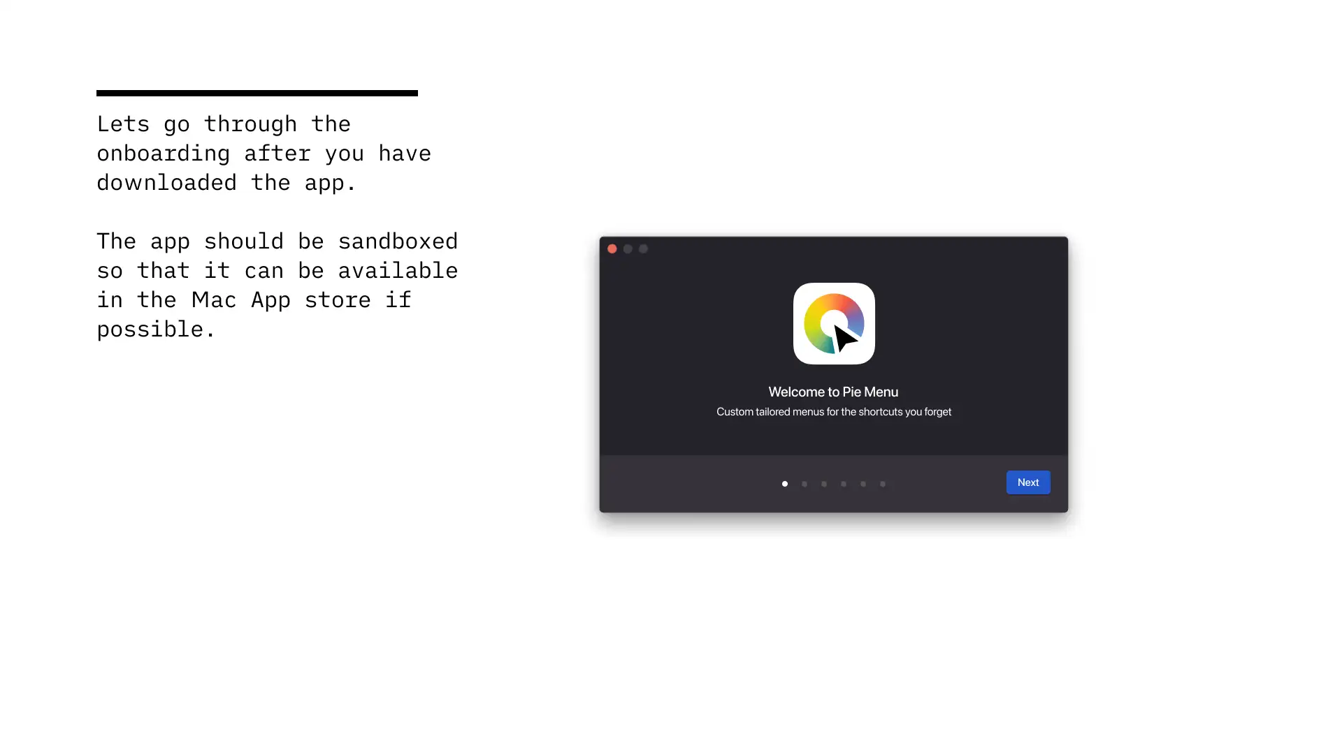
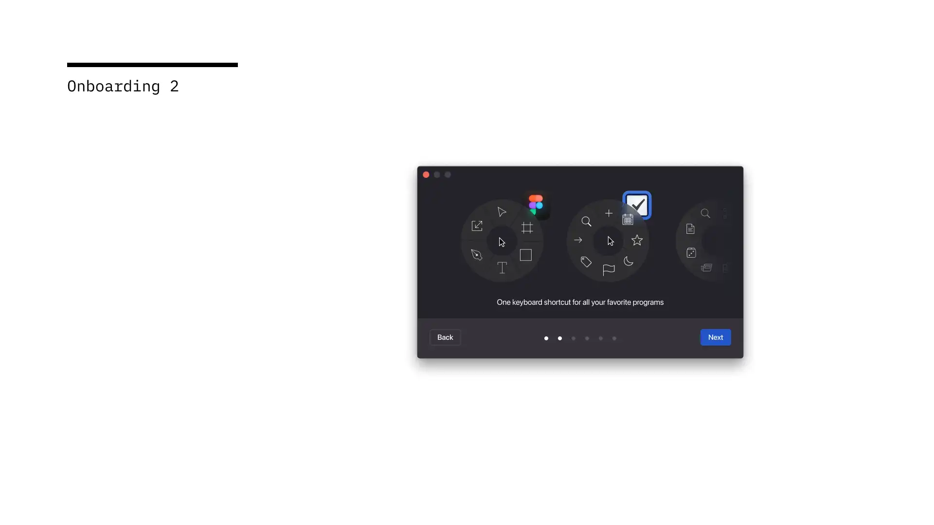
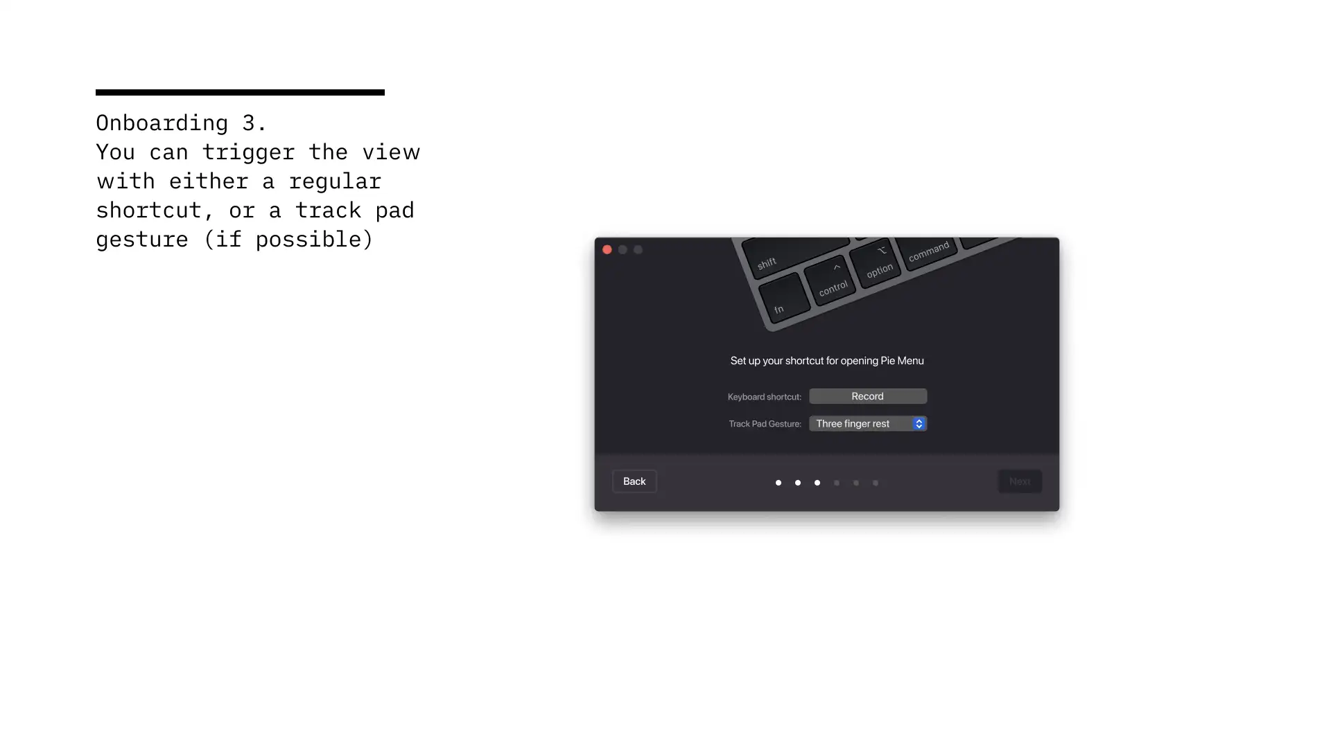
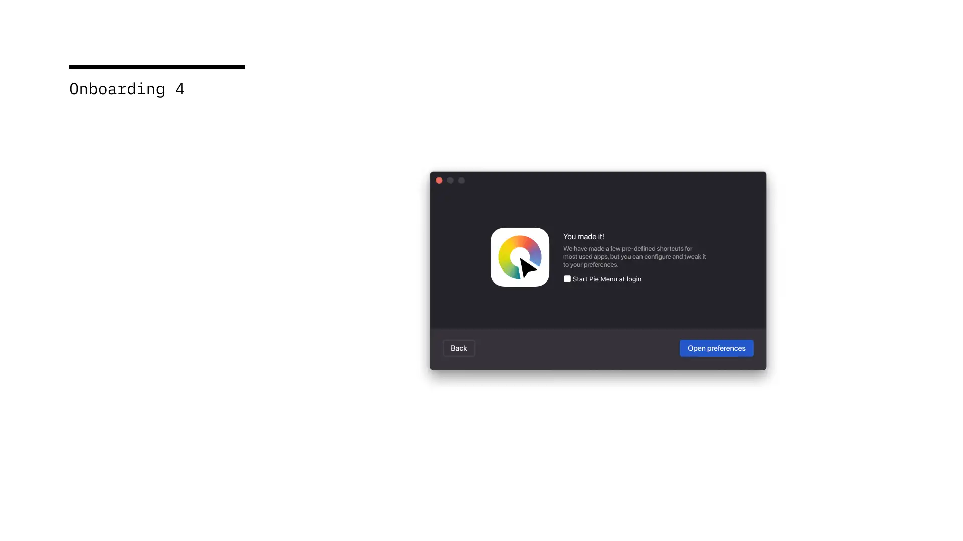
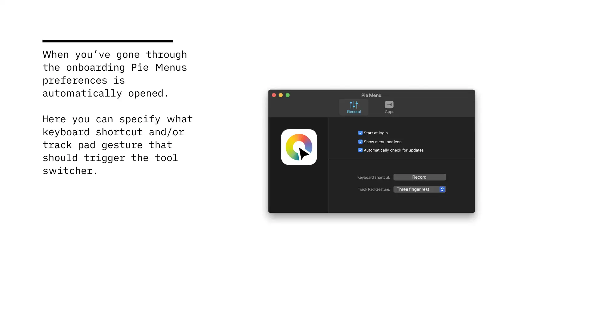
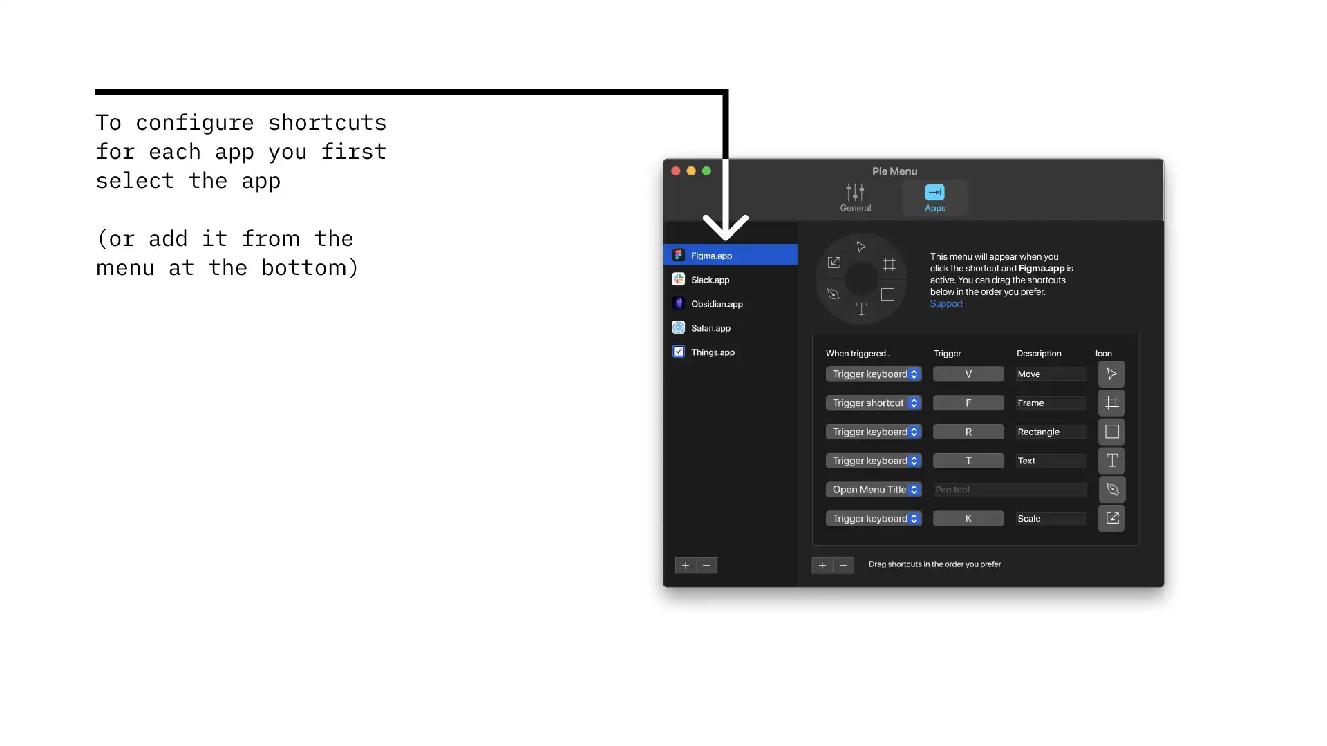
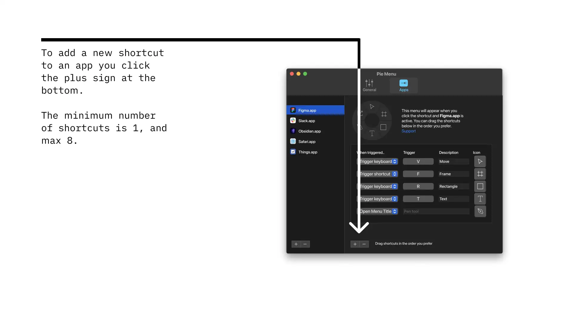
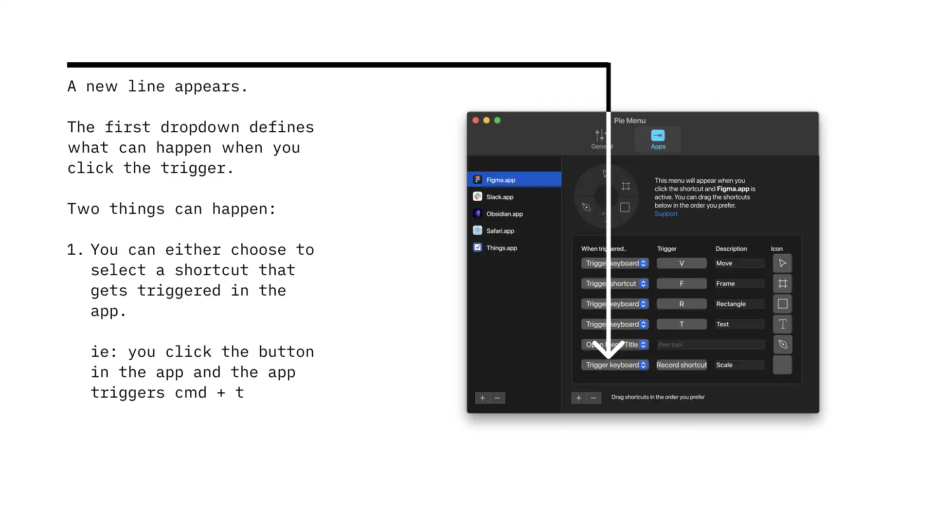
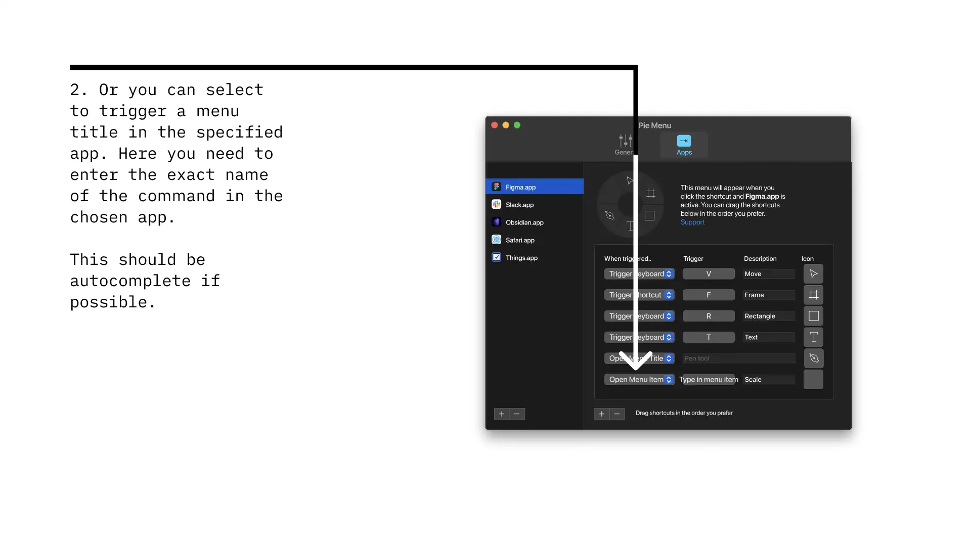
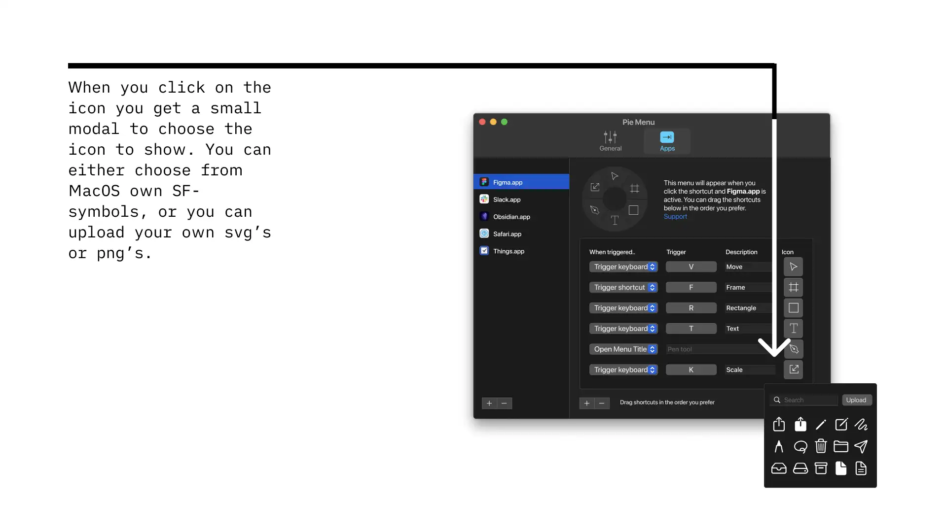
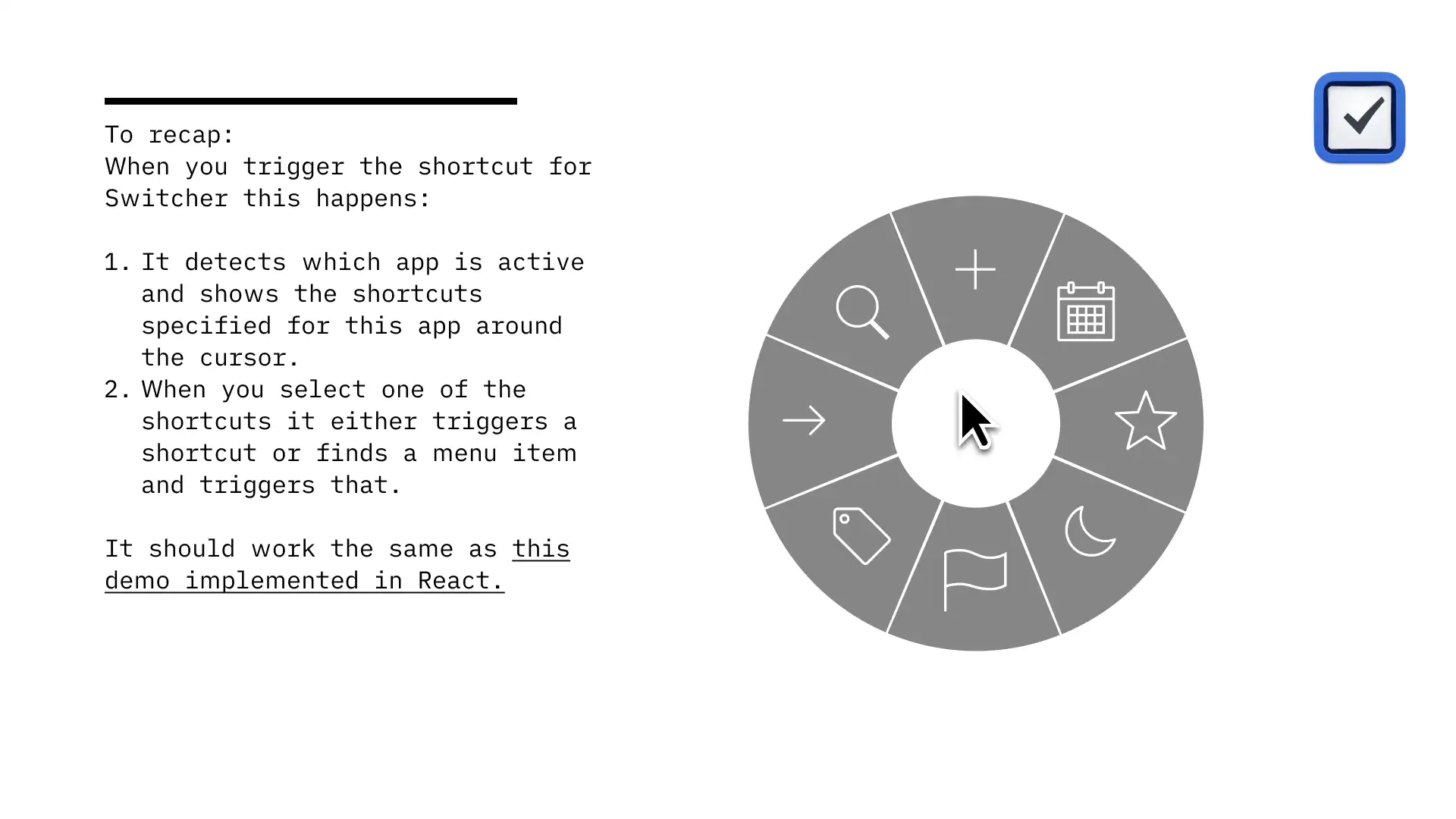
As we moved from development to launch preparation, we focused on one of the most critical aspects: the user’s first interaction with Pie Menu. If we couldn’t effectively communicate the app’s value and functionality right from the start, we risked losing users before they even had a chance to experience the product’s benefits. This realization led us to put significant effort into crafting an intuitive and informative onboarding process. Here’s what we landed on for the first version:
The onboarding process was crucial, and it was just the beginning of our journey. With this key component in place, we then faced another important decision: where to launch Pie Menu?
Choosing Launch Platforms
The App Store was the obvious choice due to its massive user base and built-in trust factor for macOS users. This was crucial as we had to be trustworthy accessing the accessibility features on users Mac and running in the background. The App Store also provided a straightforward way to handle payments and updates. However, we were aware of its limitations, such as Apple’s strict review process and the 15% commission (App Store Small Business Program).
A short while after we launched on the App Store, multiple users requested us to launch in Setapp, an interesting alternative. It aligned well with our target audience of productivity-focused users as a curated subscription service for Mac applications. Setapp’s model of bundling high-quality apps appealed to us, potentially exposing Pie Menu to a dedicated user base willing to pay for premium tools.
After launching on both platforms, I can confidently say that it’s hard to find a more engaged audience than Setapp. In the couple of weeks we’ve been there, we’ve gotten more feedback and ideas than we’ve ever received from the quieter App Store audience, making it a perfect platform for apps like Pie Menu.
We decided to launch on both platforms to maximize visibility and provide users with options. This dual approach also allowed us to compare performance and user feedback across different distribution channels, providing valuable insights for future development and marketing strategies.
Learnings from creating Pie Menu
Building on the insights gained from our launch experiences, we continued to learn and adapt. Every phase of Pie Menu’s development has been a learning opportunity, from the first lines of code to the latest user review. Looking back, there are several key decisions and approaches I would reconsider if I were to start over:
Learning 1: People hate subscription
Setting up subscriptions and getting that working was the most time-consuming task. My initial idea was that people should be able to use it for free for 10 invocations per day and then needed to pay. It was also important that they didn’t have to pay upfront but had some initial trial to test it. In the App Store, a subscription is the only option if you want to add a trial period before it starts running, so I opted for that in the MVP. In hindsight, I wish I had flipped the script—starting with a one-time payment and introducing subscriptions later, if at all. Some people get rashes on their backs when they see a subscription in an app.
Learning 2: Don’t assume a perfect setup
A couple of weeks after launch, we received reports that people couldn’t use Pie Menu on certain apps. After investigating, we discovered that the apps were located in subfolders of the Applications folder or in other locations, and that Pie Menu didn’t detect them. This oversight highlighted the complexity of macOS file structures and user preferences. We promptly implemented a fix to scan all potential locations, ensuring Pie Menu could detect and interact with applications regardless of their storage path.
Learning 3: People love localization
We also experienced users having issues with getting apps to work because of localization. We detected the current active apps based on their file names, but all the native Mac apps like Notes and Email have different names based on the language of macOS, causing Pie Menu to think it is different programs. During beta testing, we didn’t encounter this problem, but when the app was distributed all over the world the problem suddenly became apparent. We identified a solution using bundle-ids instead of app names. However, this fix is currently in our backlog, as we need to balance it against other highly requested features.
Learning 4: People become angry if it doesn’t work as they expect
User experience can be challenging. In a niche productivity tool like this, people have a lot of preferences. If it doesn’t work as they expect, they delete it or you get an angry review or mail. In our case, the main learning was that they wanted one click of the shortcut to show the menu, and a click outside it (or in it) to remove it, not as it worked in our first release where you had to hold the shortcut and release the shortcut over the Pie Menu for it to invoke. We had no issues with this during our beta-test period or our silent launch in App Store, but after a while this preference started to pour in. We quickly turned around and actually made this the new preferred way for the app to work, while the old option was still available. The great thing about this is that you could remap a hot-key on your mouse and use the mouse to trigger it!
Learning 5: User feedback is invaluable
The continuous stream of user feedback we received post-launch was a goldmine of insights. It helped us identify and prioritize improvements, from minor bug fixes to major feature enhancements. This experience reinforced the importance of maintaining an open line of communication with users and actively seeking their input.
We implemented a public roadmap with voting on the website and asked users to report issues or suggest improvements. This proactive approach not only helped us refine Pie Menu but also fostered a sense of community among our users. They felt heard and valued, which in turn increased their engagement and loyalty to the app. As we continue to evolve Pie Menu, we remain committed to this user-centric development approach, ensuring that each update brings meaningful improvements based on real-world usage and feedback.
Learning 6: Create an in-app news system
After launch, I regretted that we hadn’t implemented an unobtrusive in-app news system where I could communicate new features that were launched, the roadmap they could vote on, or they should update their app. Some of the issues people have been reporting could have easily been avoided with an update. And often when you get feedback there is a large silent majority that feels the same.
Pie Menu Website
Website Design
I knew early on that the app’s website would be essential. It would explain the app, provide a resource for users to easily add shortcuts, and provide shortcuts for popular Mac apps while serving as a long-tail SEO solution.
My initial sketch was a simple one-pager showing how it worked with a couple of examples. But as we created and used the app, I realized it became too limiting.
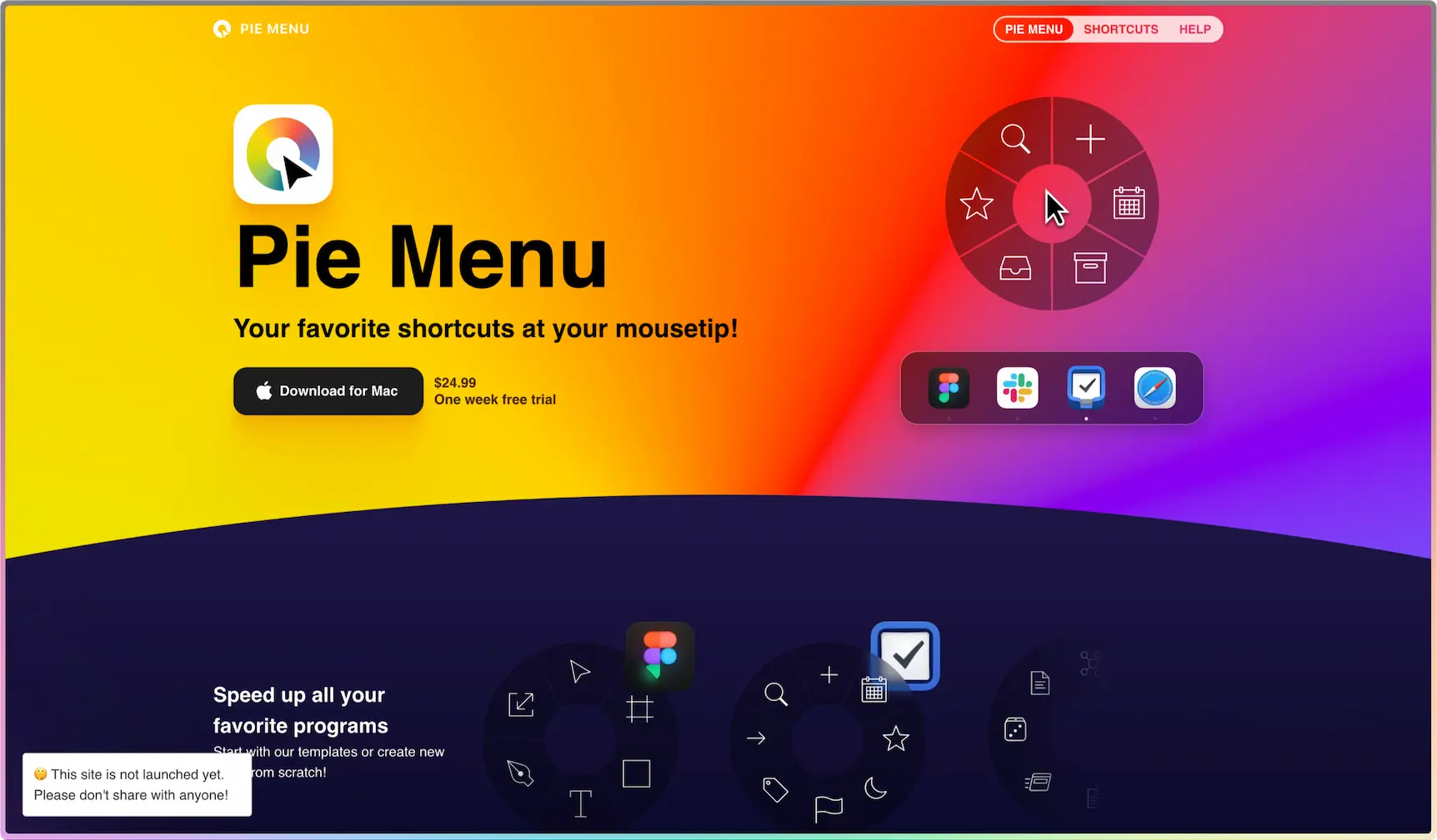
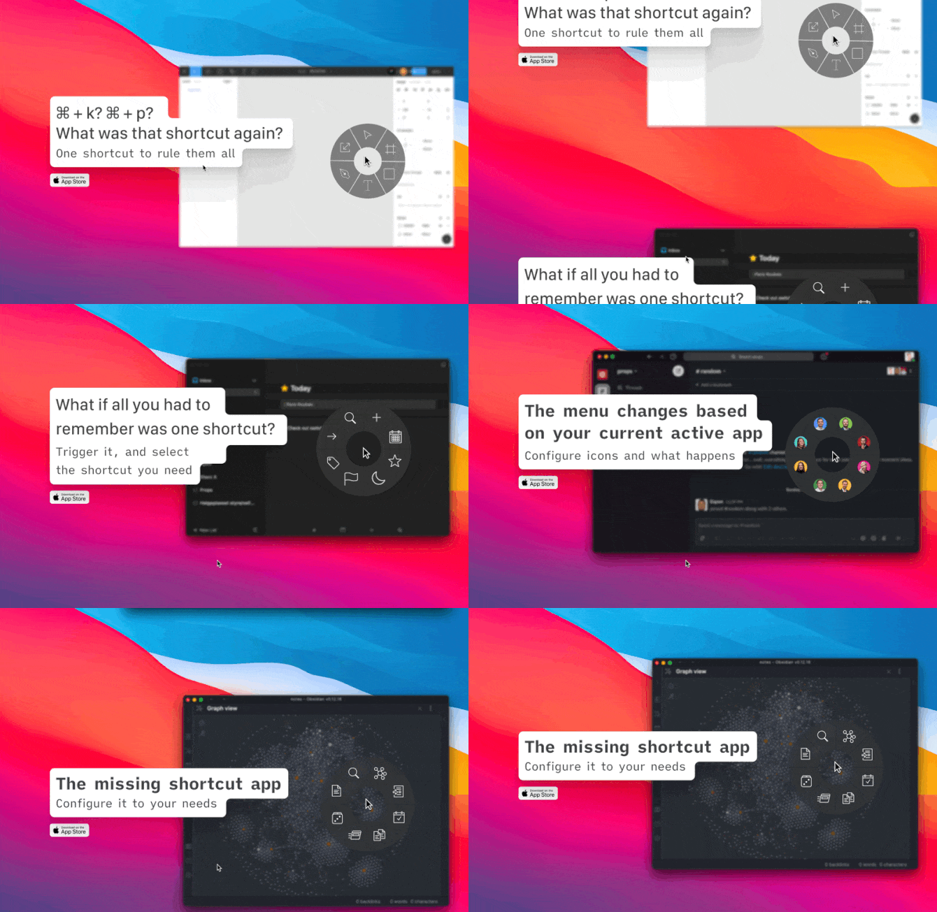
After sketching out multiple solutions, I settled on a colorful hero showing the Pie Menu and how it changed when different apps were active. However, I questioned its effectiveness. Then, I used roastmylandingpage to get feedback on my landing page. Getting expert input from someone outside the project is always valuable. In this case, it resulted in an idea of showing how the Pie Menu works with a demo on the website and more precise wording.
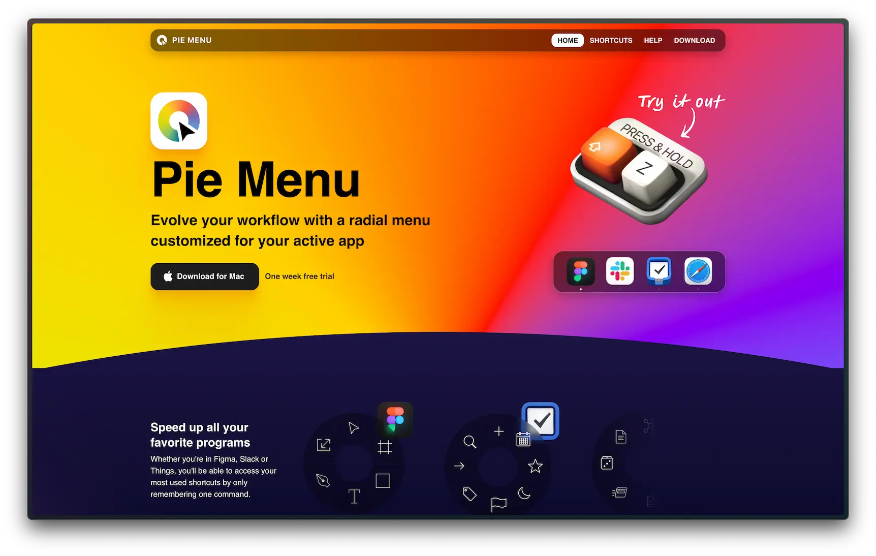
One of my most memorable facepalm moments came post-launch. I showcased the simplicity of launching the Pie Menu on the website with the shortcut Shift + Z. It seemed foolproof. Who would already use that combo? After all, it’s just an uppercase Z.
But when users downloaded the app, they often tried to use that combination and discovered that Shift + Z couldn’t be used as a shortcut. Because every time you type a capital Z, the app interprets it as a command to launch the Pie Menu. Imagine trying to type “Zebra” or “Zoom” only to have the app jump in uninvited. It was a glaring oversight, revealing how easily a tiny detail can disrupt the entire user experience.
I later tried changing it to another keyboard shortcut on the website, but Shift is one of the modifier keys that can be used safely on a webpage like this. Command, option, or control won’t work in combination with another key without risking other keyboard shortcut collisions. Shift + Z is a safe bet that will always work, even though some users downloading the app will be confused.
Remix vs Next.js
When I was developing the website, I used Remix to broaden my horizons, as I usually rely on Next.js for web development. Initially, everything seemed smooth, but things quickly took a turn when I tried migrating from Remix 1 to Remix 2. The process was riddled with hydration errors, a common issue with no clear solution. Adding to the frustration, the documentation was a tangled web, bouncing between MDN, React Router, and Remix docs.
After wrestling with these issues, I migrated the entire site to Next.js. The transition was quick, and retrospectively, it was a smart move. Next.js offered much better documentation and abundant resources, making problem-solving a breeze compared to Remix. This experience reinforced why Next.js is my go-to framework for creating robust and reliable websites.
AI to enhance the website
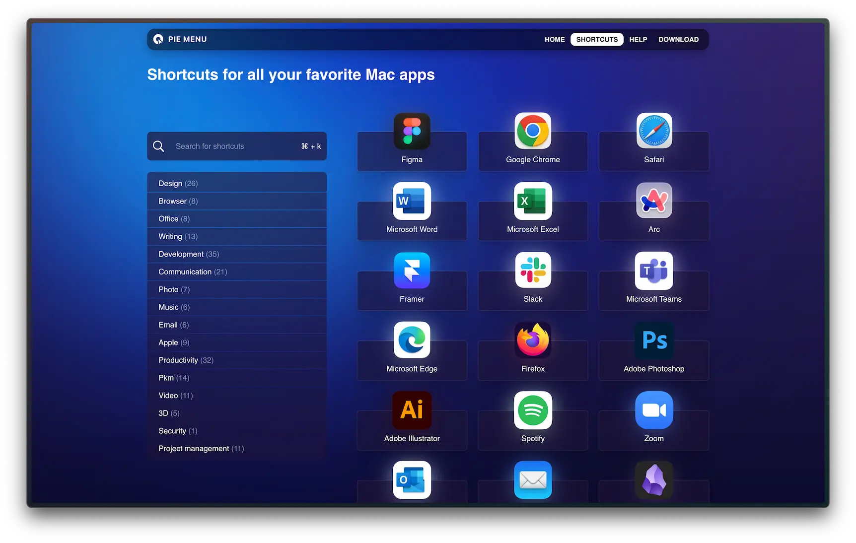
One important part of the website for PieMenu.com has been the pages for shortcuts for different apps. There are two reasons for this webpage:
- To add shortcuts to Pie Menu via data URIs. This way, users can find the shortcuts in one location and add them to the app. (On many apps, there is also a link to the webpage for that app in Pie Menu)
- Hopefully, I can get some SEO traffic to these pages, as they are a one-stop shop for finding keyboard shortcuts for many Mac apps.
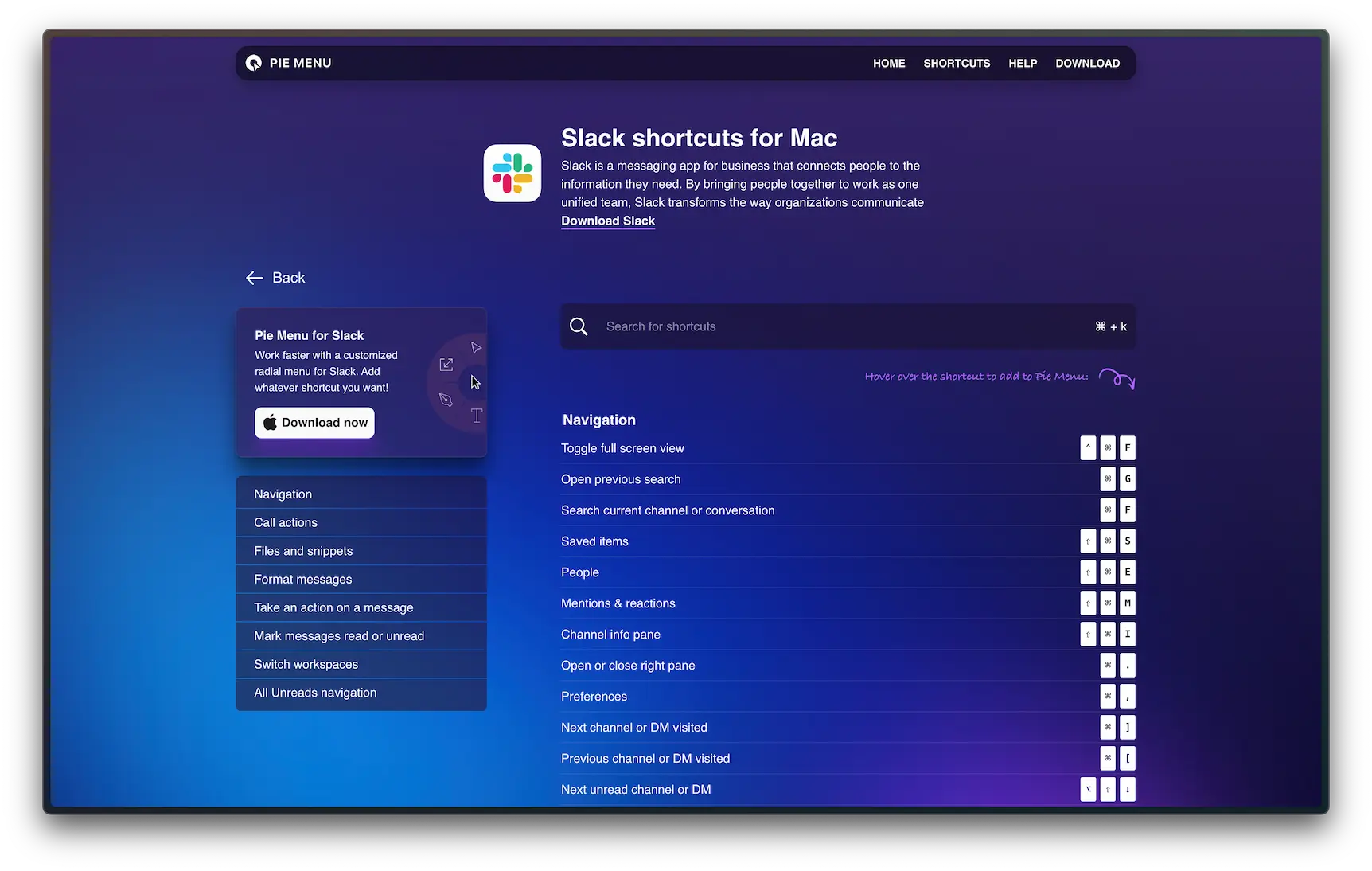
The basis for these shortcuts is a JSON file for each app consisting of the keyboard shortcuts, categorization, etc. I’ve created a trained AI Agent to structure this data to make these shortcuts in typingmind.com (affiliate link), which I use for using chatGTP and other AI models. This way, I can paste the shortcuts (or a screenshot of shortcuts) for a specific app and get the JSON data I need to create the page. This has considerably sped up the creation of these keyboard-shortcut pages, especially given that finding keyboard shortcuts for each app is a task in itself. Some companies have them on their website, some only make them available directly in the app, and for others, I’ve had to rely on various keyboard shortcut directories across the web. The process still involves downloading every app to extract the app icon in the correct format, which remains a time-consuming aspect of the project.
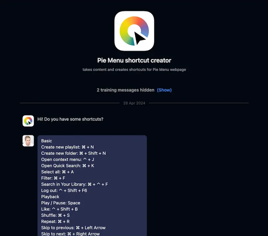
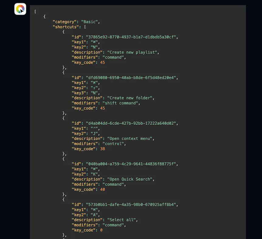
I ran the JSON output from chatGPT through a script I’ve created to ensure the IDs are unique and lint the JSON file. This way, adding new apps and shortcuts isn’t as time-consuming as it could have been.
Marketing video
A marketing video was necessary to visually demonstrate Pie Menu’s functionality. This allowed potential users to quickly grasp its concept and benefits in action. This was an exciting challenge that allowed me to blend creativity with technology. To get started, I turned to ChatGPT for some initial ideas. I thought it could help spark some creativity and give me a jumping-off point for brainstorming ad concepts. Armed with these ideas, I dove into Figma to think visually, creating a storyboard that mapped out the video’s flow and key visuals. Here’s a glimpse of my final Figma storyboard:
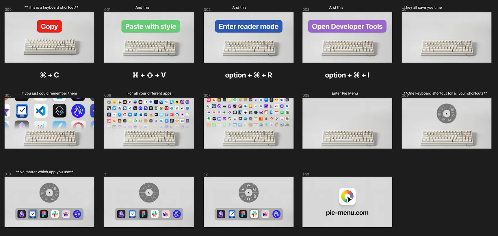
To bring this storyboard to life, I used a combination of tools and technologies. I used Midjourney to create high-quality imagery, refined the script to ensure it conveyed our message clearly, and experimented with Elevenlabs AI voice to create an engaging voiceover.
I then created a storyboard video using CapCut, synchronizing the visuals with the voiceover and adding sound effects to enhance the presentation’s impact.
While I was tempted to dive deeper into the video production process, I recognized the importance of maintaining focus on the primary goal: to launch Pie Menu and start gathering real-world feedback, not to become a video production expert. After all, this was just a side project. To that end, I collaborated with a talented 3D artist from Upwork to transform my storyboard into a polished, professional video. This decision allowed me to leverage expert skills while keeping the project moving forward.
With the marketing video complete and the app refined based on initial feedback, Pie Menu was ready for a broader audience. The next phase would focus on expanding our reach and continuing to improve the product based on user insights.
Minimum Viable Pie
If you want to see if something works, make it. The whole thing. The simplest version of the whole thing – that’s what version 1.0 is supposed to be. But make that, put it out there, and learn. If you want answers, you have to ask the question, and the question is: Market, what do you think of this completed version 1.0 of our product?
Any new product must start by being helpful to yourself. When I launch Figma (and especially creative apps) and I don’t have Pie Menu available, I get frustrated. So, how is the market reacting so far?
- The app has over 2 000 active users from Setapp.
- ~800 people have downloaded Pie Menu from the App Store and ~60 have paid for a subscription or lifetime. That is a 5% conversion rate from trial to paid, which is solid, but has room for improvement.
- The click-through rate from the website to the App Store is 14.2%. (The average here is typically 2% to 5%, with anything above 5% considered good.)
- My conversion rate in the app store is 31,95%, which is well above the 75th percentile in the App Store (~7.16%).
- I’ve received detailed feedback from many users raving that this app is something they’ve wanted for a long time and requesting more features.
- Someone has made a cracked version circulating on Chinese web pages. 🙈
Based on this data, there clearly is some kind of Product Market Fit with Pie Menu, though the feedback and usage indicate that the initial subscription model was wrong. Luckily the new version with a lifetime-price is now also launched!
Looking ahead
So far, I’ve shared the app on my X account, in a Slack community, in a newsletter and on Setapp. And last week I got a huge traffic spike after sharing it on Hacker News. After we’ve fixed our bundle-id issue, it is time to market the app more, launch it on Product Hunt, as well as continuing the work on the roadmap.
I’m hopeful that I, in time, can break even on Pie Menu. Based on the income the last months it certainly seems possible. But without this project I wouldn’t have:
- created iSecrets
- built an audience on Twitter and newsletter
- received a tweet from Elon Musk
- designed two Mac apps
- created a fun marketing video
- designed and developed an extensive website
- met a lot of interesting people online
- started to learn SwiftUI
Compared to studying formally, the money spent on learning this has been tremendously worth it, and I still have the potential upside to earn back the money used. I still have a lot of plans for building out Pie Menu (help me prioritize by voting on the roadmap), and for the next half year will slowly build out features while I work more on marketing the app.
If you’ve come so far and haven’t tested out Pie Menu yet I highly recommend you to download it and try it out! And please reach out if you have any ideas or feature suggestions!
